
Is your logo too safe? KU researcher explores the psychology behind your branding
October 7, 2016 | Meghan LeVota

Your logo may not be communicating what you want, which could hurt your business, according to new research.

Noelle Nelson
In her recent research on logo design, University of Kansas marketing scholar Noelle Nelson found that the disconnection between what founders hope to convey with a logo and how a person perceives it may discourage a business deal.
In her research, she found that consumers apply the information they gather from a logo to make sense of whatever they know least about — whether that be the product, the brand or the industry. In other words, a consumer’s interpretation of a logo makes assumptions on that which they’re most ignorant.
“Marketers are always trying to say something about their brand or product when designing a logo,” Nelson said. “But what we know about how our brains process information, we know that there would be times in which people wouldn’t automatically apply the logo information to whatever the brand is.”
Startland News sat down with Nelson to discuss her findings and how Kansas City startups may learn from it.
Do people understand your product?
For startups trying to “disrupt” a marketplace with a crisp, new product — chances are, there’s going to be a learning curve before consumers comprehend what it is you offer.
In the Internet of Things space, for example, it would be especially important to educate the purpose behind your innovation. What does the device do and why do I need it? In this case, Nelson would suggest creating a logo that showcases something about what your product is.

Homebase Technologies
That’s what Blake Miller, CEO of Homebase Technologies, aimed for with his startup’s logo. Homebase created an app that allows apartment dwellers to manage their home’s IoT devices to make life easier, thus, Miller aligned the logo’s design with that in mind.
“It made sense, it portrayed that (the technology) is in apartments or homes,” Miller said. “People live in apartments but a lot of times it’s their home base. … That was the initial reason why we called it Homebase. People who live in apartments are often times very transient and all over the place so they needed a home base to go to and they need to be able to control it when they’re not there.”
Do people understand your brand?
In some cases, even among startup companies, the product is already well understood. But when you’re just starting out, your “brand” is still new.
As such, you still will have to establish what your brand has to offer that’s different or special. In other words, you should offer a reason why a customer should do business with your firm, Nelson said.
“If you’re a pizza parlor, and you’re designing your logo completely based on ‘Hey, we make pizza,’ … People already understand and know what pizza is,” Nelson said. “So, it might be more important to say something else. Like, ‘This is why you should buy pizza from us.’”
Do people understand your environment?
If customers are familiar with who you are and what you’re selling, you’ll have to pivot to representing something with which they’re not familiar. And the solution may lie in your consumer’s perception of an industry or environment.
In her research, Nelson found that logos featuring “safe” or “stable” conditions for a safety-oriented product could instead make the consumer feel as though their environment is safe and there is no need for the product.
Nelson pointed to hand sanitizer as an example. She found that consumers used more hand sanitizer when it was accompanied by a logo that connoted “instability” or risk. People subconsciously applied this characteristic to their unstable, germ-ridden environment, since they were already aware that the product was safe.
Don’t over do it.
Nelson warns designers to not overcomplicate their logo designs. Nelson said that consumers have short attention spans and a cluttered logo may send mixed messages.

Mobility Designed
When startup founder Liliana Younger of Mobility Designed created her logo, she wanted to limit it to two colors. She also used the “plus” symbol to communicate that Mobility Designed is a medical device firm.
“Blues are always good in medical things because they connote cleanliness, and bold and clear shapes were important,” Younger said. “We went with our current design because it indicates something modern, but simple and immediately plants a seed about a medical link.”
Clarity is key with a logo and Nelson said simplicity is the best way to achieve that.
“Especially creative people who have startups, they tend to overdesign things,” Nelson said.
“They may think that their logo is really interesting, beautiful and visually appealing. But if you were to ask consumers, maybe it doesn’t give a clear message. If it’s not simple, it’s not going to be retained.”

Featured Business

2016 Startups to Watch
stats here
Related Posts on Startland News
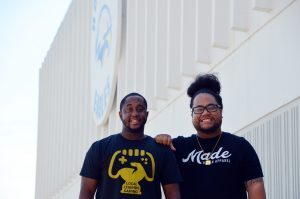
Former high school rivals from MADE, Local Legends ‘Play It Forward’ in bid to revive South KC
Organizers of the Aug. 12 Play It Forward charity basketball game traded playful taunts as they approached the doors of the former Hickman Mills High School gymnasium. “They painted over your cougar,” said AbdulRasheed Yahaya, a Ruskin High School graduate, referencing the giant eagle logo affixed to the former Hickman facility that now is part…
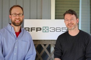
Founder: RFP365’s new Client Discovery launch shows startup-corporate deals build stronger tech products
A new product module from RFP365 defies common perceptions about Kansas City corporations overlooking tech talent in the startup community, said co-founder Stuart Ludlow, announcing the launch of Client Discovery. “Traditionally, we always say that an RFP [request for proposal] involves two people,” he said, describing the product. “Someone writes an RFP and then a…
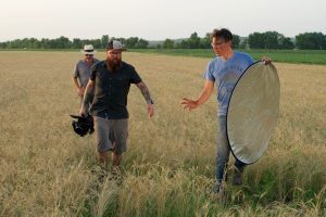
Homegrown Resonate Pictures cultivates corporate market through creative risks
The same creative energy reverberating through cities like Los Angeles, New York City and Portland can be found in Kansas City, said Marc Havener, the filmmaker behind Lawrence-based Resonate Pictures. His message for fellow creatives: “We can make this back home.” After 10 years on the sets of blockbuster movies like “Pirates of the Caribbean,”…

Happy Food gathers ingredients for nationwide grocery platform, meal-locating app
Happy Food Co. has grown beyond distributing flavorful meal kits through small, standalone coolers at Kansas City-area Price Chopper and Hen House locations, said chef and co-founder Kiersten Firquain. The 2017 Startland Under the Radar startup has now developed a software platform — in partnership with retailers nationwide and 75 local vendors — to enable grocers…