
Is your logo too safe? KU researcher explores the psychology behind your branding
October 7, 2016 | Meghan LeVota

Your logo may not be communicating what you want, which could hurt your business, according to new research.

Noelle Nelson
In her recent research on logo design, University of Kansas marketing scholar Noelle Nelson found that the disconnection between what founders hope to convey with a logo and how a person perceives it may discourage a business deal.
In her research, she found that consumers apply the information they gather from a logo to make sense of whatever they know least about — whether that be the product, the brand or the industry. In other words, a consumer’s interpretation of a logo makes assumptions on that which they’re most ignorant.
“Marketers are always trying to say something about their brand or product when designing a logo,” Nelson said. “But what we know about how our brains process information, we know that there would be times in which people wouldn’t automatically apply the logo information to whatever the brand is.”
Startland News sat down with Nelson to discuss her findings and how Kansas City startups may learn from it.
Do people understand your product?
For startups trying to “disrupt” a marketplace with a crisp, new product — chances are, there’s going to be a learning curve before consumers comprehend what it is you offer.
In the Internet of Things space, for example, it would be especially important to educate the purpose behind your innovation. What does the device do and why do I need it? In this case, Nelson would suggest creating a logo that showcases something about what your product is.

Homebase Technologies
That’s what Blake Miller, CEO of Homebase Technologies, aimed for with his startup’s logo. Homebase created an app that allows apartment dwellers to manage their home’s IoT devices to make life easier, thus, Miller aligned the logo’s design with that in mind.
“It made sense, it portrayed that (the technology) is in apartments or homes,” Miller said. “People live in apartments but a lot of times it’s their home base. … That was the initial reason why we called it Homebase. People who live in apartments are often times very transient and all over the place so they needed a home base to go to and they need to be able to control it when they’re not there.”
Do people understand your brand?
In some cases, even among startup companies, the product is already well understood. But when you’re just starting out, your “brand” is still new.
As such, you still will have to establish what your brand has to offer that’s different or special. In other words, you should offer a reason why a customer should do business with your firm, Nelson said.
“If you’re a pizza parlor, and you’re designing your logo completely based on ‘Hey, we make pizza,’ … People already understand and know what pizza is,” Nelson said. “So, it might be more important to say something else. Like, ‘This is why you should buy pizza from us.’”
Do people understand your environment?
If customers are familiar with who you are and what you’re selling, you’ll have to pivot to representing something with which they’re not familiar. And the solution may lie in your consumer’s perception of an industry or environment.
In her research, Nelson found that logos featuring “safe” or “stable” conditions for a safety-oriented product could instead make the consumer feel as though their environment is safe and there is no need for the product.
Nelson pointed to hand sanitizer as an example. She found that consumers used more hand sanitizer when it was accompanied by a logo that connoted “instability” or risk. People subconsciously applied this characteristic to their unstable, germ-ridden environment, since they were already aware that the product was safe.
Don’t over do it.
Nelson warns designers to not overcomplicate their logo designs. Nelson said that consumers have short attention spans and a cluttered logo may send mixed messages.

Mobility Designed
When startup founder Liliana Younger of Mobility Designed created her logo, she wanted to limit it to two colors. She also used the “plus” symbol to communicate that Mobility Designed is a medical device firm.
“Blues are always good in medical things because they connote cleanliness, and bold and clear shapes were important,” Younger said. “We went with our current design because it indicates something modern, but simple and immediately plants a seed about a medical link.”
Clarity is key with a logo and Nelson said simplicity is the best way to achieve that.
“Especially creative people who have startups, they tend to overdesign things,” Nelson said.
“They may think that their logo is really interesting, beautiful and visually appealing. But if you were to ask consumers, maybe it doesn’t give a clear message. If it’s not simple, it’s not going to be retained.”

Featured Business

2016 Startups to Watch
stats here
Related Posts on Startland News
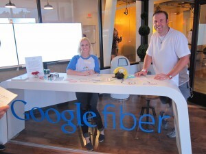
Five years later: Google Fiber celebrates a Kansas City milestone
Five years ago today, the Kansas City area heard the news that it would receive a transformative, residential gigabit Internet service. Hundreds of cities lobbied to be the first to receive Google Fiber, but ultimately, Kansas City, Kan. won the highly-sought-after service. And the world learned that on March 30, 2011. Five years later, Google…

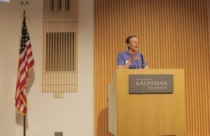
Mayor Sly James’ vision for Kansas City: Innovation and entrepreneurship
In an address to constituents Tuesday, Kansas City Mayor Sly James broadly painted his vision for Kansas City and outlined what success for the area would look like. And at the cornerstones of his ideas for the next decade? The future of Kansas City hinges upon innovation and entrepreneurship. “With Google Fiber and the smart,…
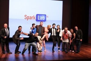
SparkLabKC nixes spring program, eyes management change
One of Kansas City’s top business accelerators is canceling its spring program amid a series of changes, including a potential management mixup. Founded in 2012, SparkLabKC will not be offering what would’ve been its fourth spring program as it evaluates its future. Through three separate classes, the organization has helped accelerate 30 area startups with…
We have liftoff! LaunchCode to boost Kansas City tech talent
About 3,500 tech firms need to fill 2,300 open positions in the Kansas City area, according to KCnext. Usually, that means businesses, both large and small, spar over the same people, snatching up programming talent wherever possible, including from their local neighbors. It makes for more than just awkward networking events among tech executives —…